


Global migration – an interactive chart
A fascinating new interactive flow chart gives an intriguing picture of migration flows around the world over the past 20 years.
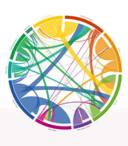
Published in the magazine Science, the chart analyses the bilateral flows between 196 countries divided into regions and captures the numbers of people who changed their country of residence over five-year periods between 1990 and 2010.
 See the chart by clicking here.
The chart shows Oceania (which includes Australia) saw 1.4 million people arrive between 2005 and 2010 and 343,000 people leave.
Most arrived from South and East Asia and most who left moved to Europe.
North America saw massive influxes from South, South East and East Asia – making up the bulk of 8 million new migrants between 2005 and 2010. In the same time, just 1.97 million people left North America, mostly moving to Europe.
Europe saw 10.5 million people arrive – mostly from South Asia, Latin America and West Asia. About 2.7 million people left Europe.
Complied by researchers Dr Nikola Sander, Guy Abel and Ramon Bauer, the chart reflects migration transition and not simply annual movements of people.
“As migration flow data are often incomplete and not comparable across nations, we estimate the number of movements by linking changes in migrant stock data over time,” the researchers says.
“Using statistical missing data methods, we estimate the five-year migrant flows that are required to meet differences in migrant stock totals.
“For example, if the number of foreign-born in the United States increases between two time periods, we estimate the minimum migrant flows between the US and all other countries in the world that are required to meet this increase.
“For each country of birth, we estimate the minimum number of migrant flows required to match differences in stocks by assuming that people are more likely to stay than to move,” the researchers say.
The researchers have replicated this estimation procedure simultaneously for all 196 countries to estimate birthplace specific flow tables, resulting in a comparable set of global migration flows.
They have made alterations to the migrant stock counts for births and deaths during the period allowing for country-specific net migration flows to closely match the net migration estimates published by the United Nations.
“The circular plot shows the estimates of directional flows between 123 countries that recorded a migration volume (immigration + emigration) of more than 100,000 people in at least two of the four time periods,” the researchers say.
Only flows containing at least 50,000 migrants are shown. The chart provides a comprehensive portrait of the global flow of people in 2005–10. It features the flows between the top 50 sending and receiving countries. Each country’s total origins and destinations are represented by the circle’s segments.
Each region/country is assigned a colour. Flows have the same colour as their origin and the width indicates their size.
Laurie Nowell
AMES Australia Senior Journalist