


Mapping the ebb and flow of global migration
Click on the map to view interactive map of global migration.
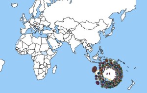
A new interactive map shows inward and outward migrations patterns for most countries in the world.
With the continuing migration crisis gripping Syria and Europe, accurate facts and figures have been compromised talk of ‘swarms of people’ and ‘invasions of illegal asylum seekers’.
But what does migration of people into and out of countries actually look like?
The International Organisation for Migration has created this interactive map that charts the inward and outward migration of the world’s population.
Using data compiled by the World Bank in 2010, it allows users to see where people from a country are migrating to, and from where migrants to that country are coming.
The map shows that for Australia, the largest groups of immigrants are from the UK, New Zealand, India and China. Interestingly, there are just 814 from Bolivia, 420 from Paraguay, 15 from Lichtenstein and 14 from the Cayman Islands.
In terms of outward migration, the UK, US and New Zealand are the most common destinations. But fascinatingly, there are 3000 Australians living in Sweden, 2000 in Nepal, 400 in Mexico, 177 in Colombia, 109 in Venezuela and 86 in Peru. Just 25 live in Paraguay and five in Honduras.
To use the map, simply click on a country and move your cursor over the dots to see where the people are coming from. Each coloured dot represents up to 20,000 migrants.
To view the visualisation map, click here.
Skye Doyle
AMES Australia Staff Writer